The Artist’s Motivation
How can we explain the fact that some paintings, sculptures, or buildings for that matter, are so fundamentally different from other works of a similar nature? Just separating them into “abstract” and “realistic” categories doesn’t seem to clarify the rich profusion of work out there.
Perhaps one means of better understanding the outpouring of artistic creativity in Western culture would be to look at some different kinds of motivation that typically prompt artists to produce art. Painters, sculptors, architects, “folk”artists, and graphic designers, for example,sometimes appear to move in broadly similar directions. Unfortunately artists don’t regularly communicate verbally about what they are doing, but by looking at outcomes, we can sometimes discern what interests them.
In the Introduction, we made the point that early Greeks saw a fundamental distinction between Apollonian and Dionysian impulses — that is, between the search for order (Apollonian) on one hand, and expression, freedom and excitement (Dionysian) on the other. Translated into artistic motivation, I think we can distinguish works which: a) are mainly concerned with “right arrangement” (order) of elements such as line,shape and color, from those, b) which are primarily directed toward “visual excitement.”
For the sake of clarity in this discussion, we shall call the “Apollonian” impulse (to achieve integrative values such as structure, order and control) by the term plastic. The desire for aesthetic excitement and freedom of expression (Dionysian), in contrast, we will call the decorative impulse. Taken separately or together, these two kinds of motivation would probably account for much of the art work described in pages to come. Though they are sometimes found separately, more often,”plastic order” and “decorativeness” occur in a delicate balance.
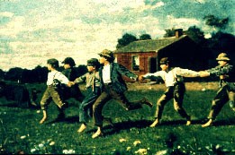
But that is obviously not the whole story of art through the centuries. The plastic and decorative impulses have certainly been major sources of artistic motivation since the end of the 19th century, but before that time, there was usually a strong descriptive impulse that moved both artist and viewer. From “life cycles” of ancient Egyptian pharoahs and Apocalyptic scenes carved on Medieval churches, to 19th-cen American paintings by Winslow Homer(Fig.4-2), artists of the past have rarely been far removed from a literary or storytelling motivation. But in the last decades of the who during the Civil War had been an “illustrator” for Harper’s Weekly,increasingly turned his attention to plastic design (formal relationships) and ultimately to visual excitement. The value of a preoccupation with “design” may have been suggested to the artist by Japanese prints, at that time circulating widely in U.S. and European art markets. It is really only in the 20th-century that significant numbers of Western artists have chosen to diminish the descriptive function of their art in favor of overtly decorative or plastic combinations of color and form.

Fig.4-4 Japanese prints flooding Paris in late 19th cen. stimulated European and American artists’ emphasis on formal coherence of shapes, quite apart from descriptive value.(Kyoto School,18th cen.)
The term “abstract,” which has been grossly over-used in our time to define works whose motivation was not literary, actually has its root in the Latin “to take from.” Homer distills “essential relationships” of shape, value and color to the exclusion of any “superfluous detail” in his 1909 brace of tumbling ducks (Fig.4-3). The artist certainly includes more information than his Japanese counterpart (Fig.4-4), but far less than he might have thirty years earlier. (Fig.4-2) The ducks seem almost heraldic in their static arrangement in space, much like figures in an “ancient icon” of Greek pottery decoration (Fig, 4-5, by Exekias, ca. 530 B.C.)
Fig.4-5. Black-figured pottery design (530-525BC) by Greek master ,Exekias, emphasizes spatial placement of forms in coherent plastic relationship.(Achilles and Ajax at the Board Game)[/caption]The Greek pottery design of course demonstrates a strong mythic aspect (literary) to balance the plastic structure of “positive and negative shapes.” Nor did the celebrated painter, Exekias, altogether neglect our need for visual stimulation, as one can detect the decorative detail of Achilles’ and Ajax’ clothing, along with a repetitive border motif in the frieze above their heads.
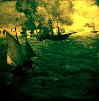
To help shed further light on these motivational distinctions, we might compare three paintings dealing with similar subject-matter (sailboats). The first, by 19th century French artist, Edouard Manet, is called The Alabama and the Kearsarge, (1861, Fig. 4-6). The second, by 20th century American painter, Lyonel Feininger, is entitled The Glorious Victory of the Sloop Maria (1926, Fig. 4-7).

Fig.4-5. Black-figured pottery design (530-525BC) by Greek master ,Exekias, emphasizes spatial placement of forms in coherent plastic relationship.(Achilles and Ajax at the Board Game)
Before Manet discarded his primary concern for subject-matter in favor of bold experiments with technique,the artist was topically interested in a naval clash of Confederate and Federal ships off the U.S. coast. This appeared a timely and challanging subject, since the French had been staunch allies of Colonial Americans not two generations earlier.
It seems clear from looking at the result, that Manet was not overly preoccupied with precise location of the celebrated ships on his canvas (that is to say, the “ideal arrangement” of the two major shapes in his composition). Nor does he really exploit a naval battle for maximum visual excitement, as did for example the English Romantic, J. M. W. Turner, earlier in the century (Fig. 4-8, above). Elements such as sails, sea-spray, banners or cannon-fire which might attract attention visually are downplayed by Manet, and woven in to the fabric of information supplied the viewer. It would appear that Manet’s motivation was primarily literary or descriptive. In an epoch before news photography, his work would have the currency of today’s video reports, and not many television viewers would carp over formal structure of images on their evening news.

Fig.4-9. Decorative excitement appears to drive Dufy’s Boat Races at Deaville, as opposed to descriptive interest or formal structure.
The Dufy painting (Boat Races at Deaville, Fig.4-9) obviously marches to a different drum-beat. Possibly recording a “regatta” at some yacht club, this work “plays” with shapes and colors suggestive of sailboats. Actually,we are not informed as to how large,or what type of sailboat they are, for it does not matter. All descriptive detail is subordinated to the visual effect of rhythmic “pointed forms,” splotches of color,and swaying lines of various thickness. Dufy would appear to be heavily motivated by a decorative impulse.
But, you might ask, is there al so a plastic sensibility at work here — that over-riding concern for the way an image is “put together?” (Dufy’s palette clearly is limited [ordered] by a complementary relationship.)
Possibly the best test of plastic content is to isolate a certain component of the painting (a given sailboat, in this case), and see what would be the result of moving that element to another position in the design. If it makes little or no difference, the conception is somewhat akin to wallpaper — a “decorative performance” which could be extended indefinitely. That is not a value judgment, but simply anacknowledgment that some art does not need to make us aware of its internal order, nor does it need to inform us. It is simply exciting to look at!

Fig.4-13. Still life by Cezanne reflects” continuities” of color and tone with which artist created coherent plastic pattern.
Another painting dealing with sail boats seems to underscore the fundamentally different artistic viewpoints at work here. By 20th-century artist Lyonel Feinenger, The Glorious Victory of the Sloop Maria, 1926 (Fig.4-7 illustrates an obvious preoccupation with the structure of geometric shapes with the logic of a tightly controlled colorscheme, and with relationships among vessels that hardly seem “accidents of history.” In this case, the artist created a strong recurrent pattern of pyramidal shapes combined with prismatic lighting effects that convey an overriding quest for order. Although this painting clearly contains substantial decorative material (line, color, shape, etc.) and a story-telling motif (“racing”), it is to the plastic consciousness that Feinenger is addressing his primary appeal. Colors are analagous blue / purple, with complementary orange in the foreground figures, hardly “accidents of nature.”
In another similar comparison, we might contrast 20th-century paintings involving the human figure: one by a French artist, Amedeo Modigliani (Fig.4-10), and another by an American named William Glackens. (Fig.4-12) The Modigliani figure is stated in general terms, with major emphasis on geometric shape of the body as it contrasts with a dark “ground” on which it rests. There is no extraneous detail (clothing, wallpaper, furnishings) of a literary nature — just a simple biomorphic form of the sort that fascinated the organization of the canvas, balance of the extremities of the woman’s body, and control of the visual components (e.g. a strong “pattern” in the dark background). As such, the Modigliani painting qualifies as a highly plastic performance.

Fig.4-9. Decorative excitement appears to drive Dufy’s Boat Races at Deaville, as opposed to descriptive interest or formal structure.
Glackens, on the other hand, tells us much more about his model: her age, apparent coquettishness, height, weight, etc., and he even goes in to some detail about what clothes she was wearing when she arrived at the studio. In addition, he paints her hat with bold colors, and a bowl of fruit (from which she lifts an apple) with almost more intensity than he devotes to the nude figure. We have to conclude that Glackens was as interested in those decorative aspects as he was in the descriptive or story-telling possibilities (“Eve in the Garden?”), but by comparison with Modigliani, his plastic motivation would seem relatively casual. How difficult would it be to relocate the bowl of fruit elsewhere on the canvas?
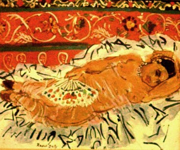
Contrast with Modigliani’s plasticity and Glackens’ prominent descriptive motivation the playful decorativeness of an Odalisque (1925) by Raoul Dufy. (Fig.4-11) Linear “arabesques” of varying colors applied to the surface dissolve the figure into a visually stimulating pattern of moving textures, but we “know” little about the model or the setting, and there is little “structure” aside from the primary color scheme and horizontal alterations of tone in the ground. As in the sail boat piece, Dufy appears to delight in visual embellishment of the canvas for decorative purposes, rather than in geometry or journalism.
To underscore the secondary role of plastic considerations in the Glackens and Dufy paintings, we might look at Stillife (Fig. 4-13) by Cezanne. It was Cezanne’s practice to relate forms in his compositions by establishing continuities between the various objects, creating “figure-ground” relationships through color or tonality that “lock” elements together visually. It seems unlikely that anyone would be tempted to “rearrange” the carefully-orchestrated objects in a Cezanne still-life. Warm and cool color and passages of light and dark are woven through the pattern like choreographed dancers, and the resulting plastic arrangement is the antithesis of all that is “accidental. “There is also a strong decorative impulse here, and the artist surely describes a table full of fruit, but everything points to a highly-focused organizational impulse as dominant in this work.
Sometimes color functions as the principal plastic element in a painting, as with Derain’s Pool of London, 1928 (Fig.4-14) where three colors, magenta, blue and red are used to create an intricate pattern of verticals and diagonals. An artist’s reliance on this type of “limited color scheme” (such as primary, complementary, analagous) suggests formal interest (as opposed to random colors of Nature).

Fig.4-15. Areas of local color in Joan Miro’s painting, Snobistic Party of the Princess (1944) are linked with decorative and literary coherence, rather than plastic structure (uniting figure/ground).
In contrast, Spanish artist, Joan Miro, combines decorative and literary impulses in a playful work known as Snobistic Party of the Princess, (1944). With self-consciously child-like conceptualism that isolates each geometric form with “local” color and arrays them on an undiferentiated field of azure, Miro eschews a broader “integrative” role for color such as Derain employed. The result is somewhat akin to a child’s game, “pin the tail on the donkey, “where in each piece of felt pinned to the play board has no “visual anchor” within the whole.
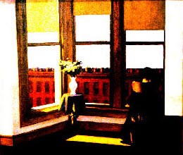
But historically, color is only one critical element utilized in the artist’s quest for plastic structure. Light-and-dark pattern, or chiaroscuro, has played a major role in the organization of visual experience since the Italian Renaissance, and as one can see in Figs. 4-16 and 4-17, painters as culturally diverse as the 17th-cen. Dutch artist, DeHooch, and the Modern American, Edward Hopper have used a strong pattern of value (tonal variation to create order in their imagery. Both artists have a strong story-telling motif in these pieces, but coherent (plastic) effects of dramatic lighting appear to take precedence over its theatrical usage (literary). Note how the dark pattern seek-out vertical and horizontal planes in both compositions, and light selectively etches surfaces which create static,”Mondrian-like” squares and rectangles.
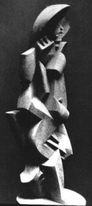
Turning now from painting to sculpture, perhaps we can see if there are beneficial applications of this motivational theory to another art form. A figure by Jacques Lipchitz (Bather III, Fig.4-18) “depicts” little that would reveal circumstances of his familiar bodily continuities, such as hands, arms, shoulders and legs. Using geometric fragments which coalesce around a vertical axis, Lipchitz integrates his plastic design into an angular pattern of light-and-dark planes. Facets of light lend the work a secondary decorative quality.
Now contrast Malvina Hoffman’s bronze of Bill Working, (Fig.4-19) which has all of the literary props: the bucket, rag, tobacco-pouch and cigarette, but reveals only marginal interest in an overarching geometry which unifies this highly anecdotal sculpture. Hoffman’s modeling creates a sublimely decorative play of light on the bronze surface, giving the piece a visual excitement to heighten its theatrical appeal.
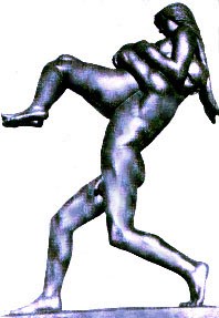
In a similar comparison of works dealing with two human figures, we might contrast the Norwegian sculptor, Vigeland’s composition Man and Woman (Fig. 4-20) with the work of a contemporary American, George Segal. Vigeland is working in bronze here, (modeling with an “additive” process), and appears to opt for dramatic simplification of the figures into a plastic unit. We aren’t given much information about these two, and they certainly don’t offer much decorative excitement for the eye. The work seems to rely almost entirely on a primitive tactile expression of physical union, arising from continuities of massive body parts.
George Segal, on the other hand, works in polyester resins to create figures as life-like as possible, occupying “real time and space.” (We will deal with the distinction between “art” and “life” in Chapter 6.) The two figures this composition (Fig.4-21, 1970) are related more by “situation” than by obvious plastic continuities,and thus one is naturally curious about the _story that connects them. Visually stimulating features such as starkly white clothing support the literary aspect here in a fashion similar to the Glackens painting discussed above (Fig.4-12).
If we set aside likes and dislikes for a moment, motivational analyses such as these may assist us in better understanding fundamental impulses that condition the entire artistic process. Later discussion of some additional psychological aspects in Chapter 7 should further enhance this understanding.

Fig.4-22. Christian iconography suggested a fish shape, with chunks of colored glass (“cullet”)refracting the heavens. (1st Presbyterian Church, Stamford, Ct., det. interior, Fig.4-22a, top.) Wallace K.Harrison, architect.
Before leaving this motivational aspect of the creative process, it might be well for us to see how appropriately these distinctions between plastic, decorative and literary motivation apply to architectural forms. “Structure” and “decoration” would seem to fit quite naturally into the building field, but how about the “literary?” Strange as it may seem at first glance, a well-known firm of architects has created a church in Stamford, Connecticut, in the form of a fish (Fig. 4-22). Clearly rooted in Christian iconography as a symbol of miraculous power, the fish shape also provided a decorative frame work for visual enhancement of the church sanctuary, with hundreds of pieces of colored-glass fitted between its “ribs.”
Since the advent of the steel-and-concrete “skyscraper”, perimeter-walls of large buildings are often not required to be load-bearing. The result in many cases has been replacement of an experience of “solidity” with visually-enhanced “screen walls,” that simply keep the weather out.
Some contemporary architects have managed to overcome the aesthetic effect of “skin” by
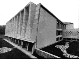
manipulating form in a plastic manner (Fig.4-23), while others exploit non-supporting walls by designing textures with great decorative interest. (Fig.4-24)
There are also architects who overcome technological demands of “an exterior veneer” by revealing structure wherever possible, and making the support system function aesthetically as a form of decoration. A cardinal example of this approach is the Pompidou Center(1971) in Paris, where heating ducts and other utilities accentuate steel structural members left undisquised throughout the building.
Architects appear sometimes to design “from the inside out,” suggesting that a floor-plan is developed and walls simply encase the resulting shape. This would be a typically conceptual approach to the problem of creating space for human activity. Each room has a separate function, and integrates with spaces having related functions. A contrastingly perceptual way of coming at the problem is exemplified by F. L. Wright’s Solomon R. Guggenheim Museum, 1957(Fig.4-25) which seems highly plastic within our definition of that term, and suggests the possibility of” integrating plan with exterior form.” This approach, which subordinates all parts to an over-arching sense of the whole, has not always been embraced among contemporary designers, but it has had celebrated exponents in the past, such as architects of the Parthenon, Hagia Sophia, and the likes of Brunelleschi and Palladio, to name a few..

Fig. 4-25. Wright’s radical Guggenheim Museum manifests perceptual design with emphasis on plastic form.
Wright conceived an art gallery in the shape of a tapering conical form, and juxtaposed this biomorphic mass against more conventional rectangular masses with in the same structural complex. The result is a strikingly different response to box-like facades of New York City’s traditional high-rise real-estate, both “open” spatially and sculpturally intriguing. Unfortunately, such “formal” solutions to architectural problems sometimes sacrifice on the utilitarian level what they gain aesthetically.One enjoys the Guggenheim’s splendid exhibits from a continuously sloping ramp, which creates a somewhat awkward sensation for the compulsive “picture straightener.”
Similarly exciting from a plastic viewpoint is Wright’s fabled Kaufmann House, 1936 (Fig. 4-26)where sweeping cantilevers (concrete decks reinforced with steel) hover in space, anchored by vertical masses of stone ashlar masonry. Relationships are the key to understanding this work (vertical / horizontal, light / dark, smooth / textured, airy / massive, etc.) with plastic orchestration similar to that used by Cezanne in his still-life painting. Decorative visual effects are inherent in the textured or smooth forms themselves, so there is no necessity to embellish with “applied decoration.”

Fig.4-26. Frank L. Wright created a”plastic symphony” of planes and textures in concrete, stone and steel, giving impetus to use of the “cantilever” in American architectural design.
Perhaps it is worth noting here that the plastic order in Wright’s house at Bear Run, Pa. is of a different kind than that governing, say, a Henry Moore sculpture. Moore’s reliance on natural forms such as bones or weathered rock for inspiration produces a biomorphic order — one which has, above all, organic overtones. In the Kaufmann House, Wright exemplifies intellectual order, a type of formal organization that owes more to mathematical proportion than to natural organic forms. One would seem justified in linking such a “cerebral” performance to the left brain, relating it more closely to the Pompidou Center than to more intuitive forms of the Guggenheim Museum.
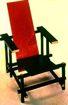
Similar distinctions can be made among “designed” objects of all sorts: for example, a chair (Fig. 4-27) by Rietveld (intellectual order) and one by Saarinen (Fig.4-28), which is biomorphic. Straight lines and right angles seem to characterize a plastic order of intellectual origin, where as sinuous appear more congenial to biomorphic taste.
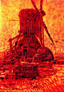
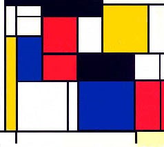
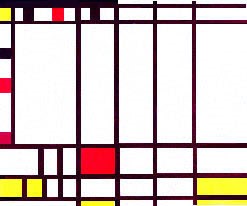
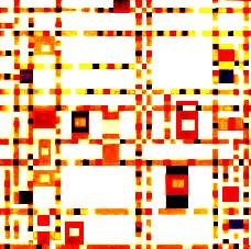
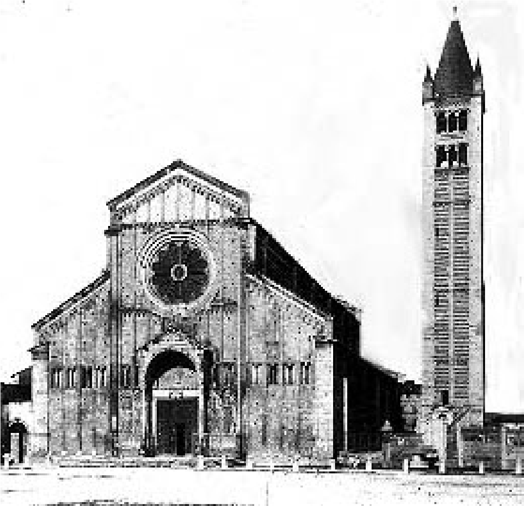
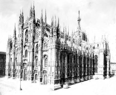
One interesting “sidelight” on the artist’s motivation is how it may change with time. Take for example Mondrian’s evolving stylistic outlook in the last years of his life. We have already seen his early descriptive style (Figs. 4-29 and 2-8), with their reflection of Van Gogh’s expressive brushwork. When Mondrian evolved his plastic style of pure geometry and color (Fig.4-30), the artist evidently aspired to forms uncorrupted by literary associations, but ultimately, “design itself” became almost the “manifest content” or subject-matter. As the now-familiar language of squares and rectangles developed, we begin to experience “enrichment” of the starkness of early experiments by proliferation of Mondrian’s “classically essential forms.” Eventually,there develops an unexpected literary dimension as we encounter the title Trafalgar Square, 1939 (Fig. 4-31, a well-known site not far from Mondrian’s Manhattan flat),and here the evolving component of visual excitement is simultaneously enhanced by more prominent lines and smaller squares of color. The final step toward both literary and decorative predominance is seen in Broadway Boogie-Woogie, 1941 (Fig. 4-32) , in which Mondrian playfully celebrates frenetic movement of traffic on New York streets, and in doing so, elaborates his forms into “pure decoration” — much as architects of Gothic Cathedrals (Fig. 4-33) had done 600 years ago in Europe. Earlier, more plastic architectural forms can be seen in an Italian Romanesque church (Fig. 4-34), which like Mondrian’s “classic” work of 1921, displays rudimentary geometry and simple planes without decorative pretention.
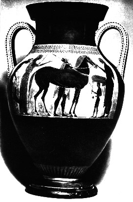
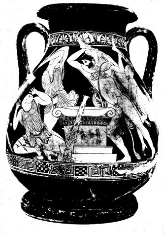
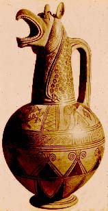
We can see a similar evolution in pottery designs of ancient Greece, also. Stylistic evolution moved from stark plastic forms of the Mycenaen forerunners (Fig. 4-35), to more fully orchestrated narrative in (classical) Doric forms (Fig. 4-36). Later designs of the early Fifth Century BC (Fig. 4-37) often reflected heightened pathos and elaborate (decorative) rhythms of Ionian taste.
It seems there is something inherent in human maturation which prompts development of artistic taste toward visual excitement, both in individual artists and in entire cultures. We generally call this trend “Baroque consciousness,” and we shall discuss the phenomenon more fully else-where.
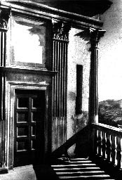
Fig.4-1. Italian Renaissance architectural design of Ducal Palace in Urbino (Luciano , 1470) reflects taste for balance and control ( suggesting a " plastic" motivation.)
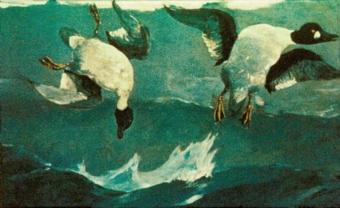
Fig.4-2 (top) An early work of Winslow Homer (Snap the Whip,1872 ) reflects 19th-cen. literary emphasis, compared with 20th-cen. plastices say, Homer's Right and Left, of 1909.(Fig.4-3, above)
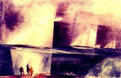
Fig.4-6. Manet's "journalistic" Alabama and Kearsarge (top) appears less focused on plastic organization than Feininger's Glorious Victory of the Sloop Maria (Fig.4-7, 1926, above)
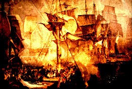
Fig. 4-8. J.M.W. Turner's Battle of Trafalgar (1806-08) memorialized a great naval victory, while neglecting neither visual excitement nor formal order.
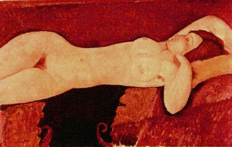
Fig.4-10. Modigliani shows interest in simple contours, and plastic light-and-dark pattern in his Reclining Nude of 1919.
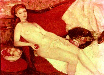
Fig.4-11. Dufy celebrates decorative possibilities of line and color in Odalisque (1925, top), while Glackens, in Fig.4-12,(Nude with Apple, above) evokes Eve's"betrayal."
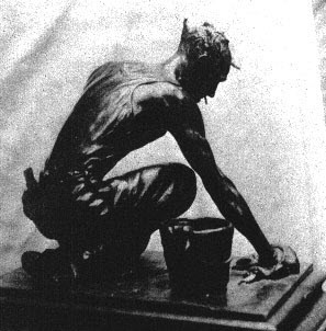
Fig.4-18. J. Lipchitz' Bather III is structured by ascending geometry (top), while Hoffman's Bill Working (Fig.4-19 above) focuses on intimate description and vivacious surface effects of bronze.
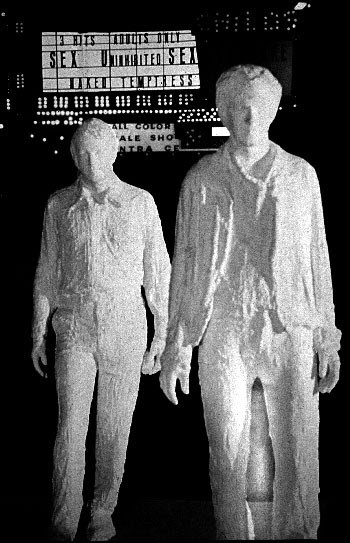
Fig.4-20, Vigeland's Man and Woman (top) uses plastic geometry more explicitly than Segal's "situational" piece, Times Square at Night (Fig.4-21, above)
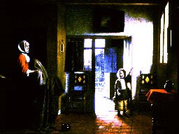
Fig.4-16. Edward Hopper's Room in Brooklyn (top,1932) shares a structural use of light with 17th-cen. Dutch painter, DeHooch.(Fig.4-17, The Bedroom,1660, above)
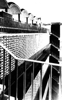
Fig.4-23. UNESCO building by Nervi (1953-57, top) develops plastic rhythms with geometric forms, while Housing Development in Mexico (Fig.4-24,) sports highly decorative surface treatment.(Flores, Mario & Salvador, architects. above)
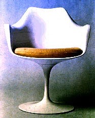
Fig.4-27. Chairs, like buildings, reveal bias of designer. Rietveld work, top, is intellectual and conceptual; Saarinen design (Fig.4-28, above), reveals biomorphic/perceptual approach to seating.
