The Artist’s Tools
—
Line
Having identified a few of the complex inter-connections that characterize the “creative process,” perhaps it is time now to focus on the artist’s tools themselves. Basically, the visual designer works with line, shape, chiaroscuro (light and shadow) as well as color and a variety of other elements including texture, material and form.
Probably the beginning-point for a majority of artistic ideas is linear. Children seem instinctively to conceive their initial forms as “a think with a line around it.” This suggests a conceptual basis for a child’s early creativity, rather than motivation in sense experience (perceptual).
In the late 20th-century, drawings have achieved a stature nearly comparable to painting and print-making, possibly because paintings have gained extraordinary monetary value in our time, making them inaccessible to many collectors. But for much of the history of art, drawing was simply something one did in preparation for a more substantial work: a fresco or later an oil painting.
Once we dissociate line from its traditional role as precursor of painted images, there opens up a myriad of possible linear expressions. Let’s take a look, for example, at an instructive variety of drawings of trees by some well-known artists.
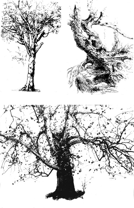
Three gifted craftsmen evidence varied tastes in linear drawing style: Leonardo (Fig. 3-2, left/ top), Thomas Cole (Fig. 3-3, right/top) and Andrew Wyeth (Fig. 3-4, above). Results are as varied as their origins.
In the first of these works (Fig. 3-2), the Renaissance master, Leonardo (Study of a Tree, early 16th cen.) focuses much of his energy on defining the edges of his forms, creating an “outline” of individual branches. The 19th century American artist, Thomas Cole, on the other hand, substantially avoids drawing the edges of his tree form (Fig. 3-3, Study for Trees, pen & bistre ink, ca. 1825), choosing instead to concentrate his line on the surfaces of the form itself. Line serves here as texture, which enables us to follow the contours of gnarled roots and branches much as sculptors articulate musculature of an arm or leg. One looks in vain for the “hard edge” where line separates what is “inside” the form from what is “outside.” (This is also a compelling illustration of a tactile approach to the description of form, incidentally. The drawing functions like a topographic map of terrain.)
The third example, by Andrew Wyeth (Fig. 3-4, Sycamore Tree, n.d., dry brush), is a different kind of drawing, done largely with a brush and ink rather than with a pen. Tonality becomes important here (since ink can easily be diluted to create grays), and line itself now is synonymous with “branch,”rather than enjoying a life of its own, as in Leonardo’s work. In the Wyeth drawing, line develops a “spatial” context, as well, because as the branches (lines) become more and more attenuated, our perception is of form moving toward us or away from us in space.
Just as Wyeth fused the concept of “line” with concept of “branch,” architects have in many instances devoted much attention to the “line” of their structures. Take for example a Hockey Stadium are as elastic and resilient as any of the natural at Yale University by Eero Saarinen (Fig. 3-5), or the astonishing bridge forms of Swiss designer, Robert Maillart. (Fig. 3-6) The contour lines of these concrete masses are as elastic and resilient as any of the natural forms in the drawings above.
As we have seen in the dry-brush work of Andrew Wyeth, once line is successfully dissociated from its workhorse function as a purely descriptive tool (outline), there are many creative ways to use it. Line may have an expressive function (as does color) in paintings of Wassily Kandinsky or John Marin. Kandinsky’s line is desultory, biomorphic and capricious (Fig. 3-7), seemingly detached from any “object” we might imagine. Marin’s use of line, on the other hand, is regular or geometric, invoking urban images of tall buildings, wires or cables. (Fig. 3-8) The Brooklyn Bridge seemed to fascinate Marin, who painted Manhattan through the skein of its innovative suspension system.
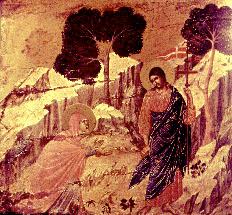
Fig. 3-9. Duccio’s linear style effectively “flattens” trees and rock formations in his small tempera painting, Noli Me Tangere (early 14th c.)
In many respects, it is possible to chronicle the evolution of Western painting style as we know it in terms of differing viewpoints about the use of line. Beginnings of European artistic tradition emerged from Medieval stained-glass (which had a heavy tracery of lead around each segment of colored glass), and from the pen drawings of Carolingian manuscript illustrators. As society began moving from the ecclesiastical to the secular around 1300 AD, Italian artists such as Duccio di Buoninsegna (Fig. 3-9) found a market for small paintings on wooden panels, preserving much of the linear delicacy of the International Gothic tradition. In much of Duccio’s work, an agitated profile line animates edges of natural forms, as in earlier manuscripts (Fig. 3-11) and Gothic sculpture.
As if to “define the polarity” of the next 200 years, Giotto di Bondone painted a series of fresco murals in the Arena Chapel of Padua (Fig. 3-10, 1305), which were almost sculptural in their concern for broad tactile planes and diminished interest in the linear tracery of International Gothic Style (cf. Duccio). Painted into wet plaster, rather than on wooden panels, Giotto’s figures have palpable bulk, but like those of Michelangelo at the end of the era, they owe more to Tuscan and Classical figurative forerunners than to linear imaginings of cloistered monastics.
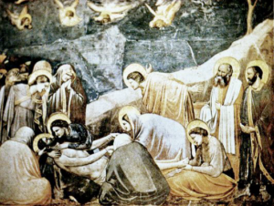
Fig. 3-10. Giotto di Bondone initiated a virtual “sculptural” approach to form in his fresco mural, Lamentation (1305, Padua), setting the stage for a radical new Renaissance Monumentalism.
The Italian Renaissance artist, Leonardo DaVinci, represented a pivotal figure in the linear tradition (sometimes described as “Lyricist”) in the South. (Albrecht Durer and others continued to nourish a linear bias in the North.) Among Italian artists who developed from early religious roots, Fra Angelico and Botticelli seemed to incline naturally toward line as the essential tool for expression of their piety. (Fig. 3-12) Sharp delineations of form combined with “local color” (limiting particular colors to a specific object) in the traditional technique of Lyricist painting.
Like earlier Lyricists, Leonardo appears to have “thought” with line. His sketchbooks are replete with line drawings -some tentative and experimental, some polished and “scientific” — from which painted images sometimes emerged. Leonardo’s mastery of line as a graphic tool is evident in his Head of a Young Woman (Fig. 3-13, n.d.) One can observe that Leonardo’s concept begins with an outline — a profile -from which all else follows. It appears that his line commences at the base of the neck and does not falter until it makes a complete circuit around the head. “Shading” typically proceeded from profile to interior, as though reality began at the edge of the form.
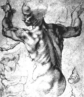
Fig. 3-14. Michelangelo’s sketch for the Sistine Ceiling suggests concern of a sculptor for planes in space, rather than emphasis on edges.
It’s conceivable that Leonardo’s fabled animosity toward Michelangelo was actually grounded in a fundamental difference of perception. Michelangelo’s drawings appear to focus mainly on the bulk of the musculature (Fig. 3-14), much as a stone-cutter encounters the carved form first where it projects farthest into space. Edges simply delimit form. Thus, one is not accustomed to experiencing “hard edges” in drawings of Michelangelo, when compared to typical renderings of Botticelli or DaVinci.
Great early Monumentalist painters such as Uccello, Piero della Francesca and the young Mantegna seemed to rely more on tonality than on line, and more on a tactile sensibility than visual excitement. Quite appropriately, the Early Renaissance sculptural tradition of the young Donatello and Jacopo della Quercia (effectively culminated by Michelangelo and reinvigorated by Rodin, Moore and Vigeland in the late-19th and 20th centuries) has also come to be identified with this Monumentalist tradition.
Sometimes, line will simply become a decorative or textural device, as in the woodcut seen in Fig. 3-16, or the unique architectural setting of a wall broken by linear projections that appear to move constantly with changing light (Fig. 3-15). In both, line becomes virtually a kinetic symbol, signaling directional movement (as is often the case in cartoons). Jackson Pollock relied on the spontaneous quality of a moving line of wet enamel paint (often poured from a step-ladder) for the uniqueness of his “action painting” shown in Fig. 3-17.
Shape
Line extended in space produces shape, which is one of the artist’s most provocative tools. Much of Henry Moore’s sculpture, for example, has what we call a biomorphic shape. This refers to an “organic” quality that
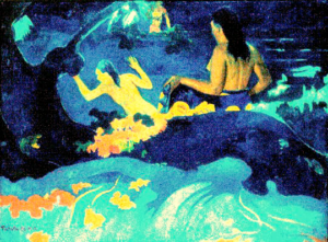
Fig. 3-20. Gauguin’s Fatata te Miti (above, 1892) presages 20th century artists’ delight in decorative forms.
links his forms to rounded and elastic contours of living matter (Fig. 3-19). Few of this artist’s works have the brittle, manmade quality we encountered in his conceptual mother/child/rocking-chair composition discussed earlier. In contrast, angular shapes evocative of utilitarian machinery (often described as imposing intellectual order) are seen in the Cubist-inspired work, Archipenko’s Seated Woman (Fig. 3-18), pictured above. The “spinal-column” effects rigidity of an architectural support, and a “thigh” imparts Cubism’s austere intellectual geometry, rather than contours of a human form.
Shape became important for the Post Impressionist painter, Gauguin, whose emphasis on decorative, “irrational” color helped open the way for Expressionism in the next century (Fig. 3-20). One may discern a variety of flat, spontaneous forms “identified” with floating leaves or cascading water in his Fatata te Miti (1892). These exuberant shapes virtually have a “life of their own” as decoration rather than as object .
Chiaroscuro
But there are limits to what one can depict with line alone, given even the mastery of a Cole or a Wyeth. Later in his career, Leonardo himself turned to what Italians call chiaroscuro (light-and-shade) in order to portray more of the “workings of men’s souls” (Fig. 3-21). Gray tones (on a scale from black to white and known as Value) enable the artist to depict moods, define spatial continuities, and establish figure ground relationships far more effectively than with line alone.
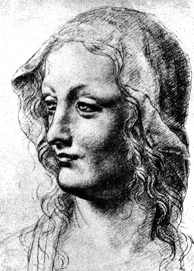
Fig. 3-21. Leonardo relied heavily on chiaroscuro for nuances of affect in portraits such as Bust of a Woman from his sketchbooks.
Among the many artists who have exploited chiaroscuro with unusual power are former newspaper illustrators such as Daumier in France and several members of New York and Philadelphia’s “Ashcan School.” Before the era of color printing, these artists created expressiveness in rapidly-executed monochrome prints for inclusion in newspaper press runs. Color is invariably subordinated to light in Daumier’s social dramas (Fig. 3-23, 1848), much as it is in works of the American, John Sloan (In the Wake of the Ferry, Fig. 3-24, 1907). Visual organization of Daumier’s canvas relies almost entirely on gradations of light and shadow to structure a melange of figures, and also to suggest the socio-political hardships faced by Parisian bourgeoisie. Sloan too mixes structural and psychological functions in a tightly confined rectangle of illumination through which his lonely rider on the Staten Island Ferry regards a cold harbor beyond. Chiaroscuro has typically been the primary focus of great print-makers, enabling such engravers as Whistler and Rembrandt, or lithographer, Kathe Kollwitz, to weave light-images deeply expressive of the human spirit.
One could virtually chronicle the history of painting as we know it in terms of the rich variety of uses artists have made of chiaroscuro. Around the year 1290 AD, the Italian master, Giotto, used chiaroscuro to give Biblical figures a sense of tactile reality painted images had not known before (See Fig. 3-10). A plague which swept much of Europe delayed exploitation of Giotto’s discoveries until Masaccio’s brief but meteoric evolution over a century later. Masaccio found he could use chiaroscuro to give painting the power of relief sculpture (Fig. 3-25).
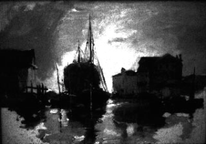
Fig. 3-22. A study of Harbor Chioggia by early 20th-cen. American painter, Frank Duveneck, reflects artist’s painstaking analysis of light and shadow.
In another century, Leonardo would exploit the subtle emotional possibilities of light and shadow, to be further developed after 1600 in pious views of moody peasant interiors by the Le Nain brothers of France (Fig. 3-26). When Rembrandt signaled the rise of a Protestant aesthetic in Dutch painting, it was sparse of color and turned the light inward, dematerializing earthly form into spiritual matter by some alchemy involving pigment and smoldering luminescence (Fig. 3-27). After 1800, Goya harnessed chiaroscuro to a paranoia aggravated by Napoleon’s warcrimes in Spain, and later Daumier would secularize that preoccupation with light at first for socio-political (Fig. 3-23) and eventually, for purely aesthetic ends.
The beginning of Modern painting style as we know it came when a French revolutionary named Edouard Manet (1832-1883) began to take liberties with chiaroscuro (The Ball Scene, 1873, Fig. 3- 29). Note that the woman’s gown disappears in a flurry of flat brushstrokes, with little or no modeling. His Olympia of the same year was redolent of Renaissance idealism, but strained Neo-Classical taste with its chalky white expanse of flesh. Manet later found he could assert dominance of the flat pictureplane by virtually abandoning chiaroscuro altogether (Fig. 3-30). Since Manet, painters have not felt bound to the world of gravity or ponderation that mesmerized Giotto and Masaccio. Absent the concern for tactile solidity, chiaroscuro then is liberated to fulfil other historical functions: psychological, social, spiritual, political or aesthetic.
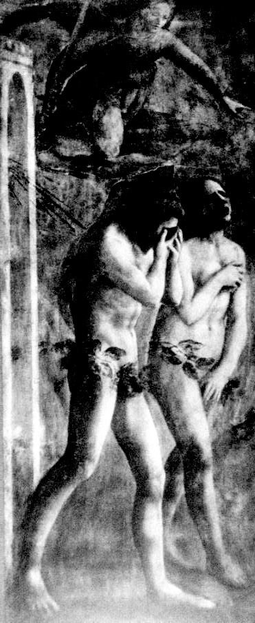
Fig. 3-25. Figures of Adam and Eve from the Expulsion evoke tactile qualities of relief sculpture in Masaccio’s fresco painted in 1427.
An American by the name of Ivan Albright discovered the effectiveness of chiaroscuro in focusing attention on the pathos of crumbling human physicality (perhaps simultaneously creating a tribute to enduring spirit). (Fig. 3-31, Fleeting Time, Thou Hast Left Me Old, 1929-30/detail.) Others, such as Albert Pinkham Ryder, cloaked images in a gloom which critics perceived as “mystical,” though it may as easily be construed as having arisen from the slough of psychological depression. (Fig. 3-33, Toilers of the Sea, 1890)
A more recent innovator in psychological applications of chiaroscuro is the American, George Tooker, whose figurative fantasies have properties of Magic Realism, a mix of heightened optical sensation and dreamlike scenarios. His art does not reject discoveries of proto-Renaissance masters, but employs these time-honored tools to create a Gestalt of neurosis. (Fig. 3-32)
Once Manet had ignited imaginations of the Impressionists with luminescence of his white underpainting, chiaroscuro was no longer the sine qua non of representational language. For the next century, artists would treat light as but one of their tools, and three Post-Impressionists, Cezanne, Gauguin and Van Gogh, would enunciate the conviction that color, not light, was the wave of the future.

Fig. 3-1. Sheeler's The Artist Looks at Nature suggests myriad possibilities for manipulation of a viewer's perception of reality.


Fig. 3-5. Architecture has a "line," sometimes static, often moving and lyrical. Eero Saarinen explores motion in his Stadium at Yale (top), as does designer Robert Maillart in a concrete bridge near St. Galli, Switzerland. (Fig. 3-6, 1933-40, above) Hockey


Fig. 3-7. Improvisation 28 by Wassily Kandinsky (top, 1912) brought an almost musical detachment to use of line and color for spontaneous visual effects. Taut line in John Marin's Region of Brooklyn Bridge Fantasy (Fig. 3-8, above, 1932), reflects an implied structural logic.


Fig. 3-11. Manuscript illumination (top, Ebo Gospel Book, 9th cen. A.D.) presages linear intensity of Botticelli's "Lyricist" Birth of Venus (detail, Fig. 3-12, above, 1485)

Fig. 3-13. Leonardo's Y Head of Young Woman (right, n.d.) relies heavily on profile line to define form. "Shading" is ancillary


Fig. 3-15. Mural Composition by Maxime Descombie (left, 1957) uses linear pattern to animate a wall, while woodcut artist, John J.A. Murphy creates a kinetic effect (above, 1921) in linear textures of a wood engraving entitled Wild Horses (Fig. 3-16).

Fig. 3-17. Jackson Pollock's kinetic style, called "action painting," made "gesture" the operative subject-matter of a linear pastiche in his Autumn Rhythm (det. above, 1950).


Fig. 3-18. Archipenko's Seated W oman evokes shapes of mechanical inspiration (top, n.d.), while Moore's Reclining Figure (Fig. 3-19, 1930/ above) has the organic flavor of a pelvic bone.


Figs 3-23 Noteworthy examples of color subordinated to chiaroscuro include Daumier's The Revolt (above top, 1848) and American, John Sloan's In the W ake of the Ferry (Fig. 3-24, 1907, above)

Fig. 3-26. Pathos of "commonfolk" dining simply in A French Interior motivated Louis LeNain's study in light and shadow (circa 1645).


Fig. 3-27. Metaphysical lighting irradiates Rembrandt's etching, The Three Crosses (4th State, top), while Daumier's illumination dramatically exaggerates figures In the Studio of the Sculptor (Fig. 3-28,).

Fig. 3-29. Time-honored academic techniques for modeling form fall into question as Manet eschews chiaroscuro in passages of the Ball Scene of 1873.


Fig. 3-30a. Detail (top) reflects Manet's increasing abandonment of chiaroscuro in his Bar aux Folies Bergeres ( Fig. 3-30, below, 1882) as he embraces a shimmering surface and evanescent forms.

Fig. 3-31. Ivan Albright's studies of the figure seem to arouse acute tactile sensations as they delve into realms of psychological extremity (det: Fleeting Time, Thou Hast Left Me Old, 1929-30).


Fig. 3-32. Voice (1963, top) by American, George Tooker, employs tools of optical verisimilitude (chiaroscuro) to arouse a psychological response, while Albert P. Ryder ( T oilers of the Sea, ca. 1890, Fig. 3-33 ) cloaks reality in a skein of darkness which may well have received impetus from his own complex emotional state.