Color and Knowing
One of the major elements available to the visual artist in the quest for expressive power is color. Certain aspects of color usage are primarily subjective, depending on one’s experience and personal taste. Other aspects of color theory are not related to taste, but involve some understanding of dynamics of visual experience. It is to these relatively objective aspects of color-dynamics that we turn now, in order to better understand how visual artists employ color in their work.
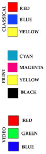
Fig. 3-35. Colors above define three different schemes with which painters, printers and videographers synthesize hues of infinite variety.
In order to discuss relationships among various colors, it is customary to place them in a circle reflecting their prismatic arrangement in nature. (Fig. 3-34.) Our perception of color is based on lengths of lightwaves transmitted to our retina, and we speak of a given “hue” as the color reflected from any object, as opposed to those which that object absorbs.
Names of various hues (red, blue, yellow, etc.) are learned by most of us in kindergarten, but outside of art-related fields (such as interior design), we seldom have occasion to learn how to describe relationships among them. It is these color relationships which artists knowingly manipulate to achieve their ends.
Probably the most fundamental category of color is what has traditionally been called “primary” color. These three colors (red, blue, yellow) have formed the basis for all other hues (i.e.”secondary,” “tertiary,” etc.). With the advent of color printing technology, presses typically ran four colors, three primaries and black (actually a non-color), with the result that we instinctively think of the unaffectedly simple quality of “comics” when confronted with primary color.
Today’s commercial printers formulate a full range of hues which we call “Process Color,” based on “CYMK” (Cyan/greenish-blue, Yellow, Magenta/purplish, and K/black). These can be mixed with almost infinite variety by simple percentages of CYMK inks. Most of the printed images we see daily on the pages of books and magazines are made up of tiny “dots” of CYMK colors in measured juxtaposition to one another.
To further complicate matters for the uninitiated, however, modern television technology has created yet another scheme for the synthesis of color hues in our retina. (A concern that the French Impressionists also had in the 1870’s.) This one is known as the “RGB” system, and produces a complete spectrum of color with the basic building blocks of Red, Green and Blue projected on a television screen, (or in this case, a computer display.) The eye directly absorbs the light-rays in this instance, rather than those reflected from a more-orless absorbant object. Mixture of 100% Blue and 100% Red light produces Magenta, while 100% Blue and 100% Green produces Cyan. Black is simply the absence of light rays, and White occurs with addition of 100% Green.
Artists not dealing with video or printing media generally continue to conform to “classical” color theory, because in its opaque state on canvas, color functions differently than in transparent “overlays” (printing) or in projection onto a cathode tube (televi- sion).
Primary Color
Primary colors have long been associated with “universal” spiritual values in cultures around the world, so that one is accustomed to identifying gold (saffron) with robes of monastics, rich (burgundy) reds with Cardinals and (cobalt) blue with royal households. Usage of these “basic building blocks” of primary color by Mondrian (e.g. Fig. 2-9), was apparently related more to theory (“pure plasticity”) than to sensuous preference. Matisse also exploited this “purity” and “simplicity” on occasion, as in such paintings as Lady in Blue, 1937 (Fig. 3-36) where he limits his color-scheme almost entirely to primaries. Curiously, a mixture of these same primaries in varying proportions can also produce either gray or brown, along with an infinite variety of other hues.
Secondary Color
Mixing of any two primary hues will produce a secondary such as green (blue and yellow), purple (blue and red), and orange (red and yellow), all with distinctive wave-lengths discernable by the human eye. (Fig. 3-37) Further blending of a primary and a secondary produces tertiary color (violet, chartreuse, blue-green, etc.) with the resulting “mixture” becoming increasingly personal (atypical) as it moves away from the primaries. Since primary and secondary colors are more commonplace, they often appear somewhat “generic.”
Complimentary Color
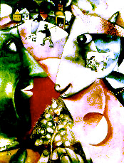
Fig. 3-38. Chagall’s I and the Village (1911) uses complimentary color (red/green, blue/ orange) to reflect tension surrounding painter’s nostalgia for his home in Russia.
Certain relationships among colors as they are displayed on the color wheel become the basis for subtle choices made by painters and other art professionals. Among these relationships are those of complimentary colors — opposites on the color wheel. Because of the quality of opposition, complimentary colors are thought to create maximum tension, such as we find in Chagall’s red/green confrontation in Fig. 3-38. (I and the Village, 1911) Decoration of Christmas trees with similar complimentary tension produces gaiety, and perhaps that was part of the latent content here, since Chagall celebrated his childhood in Russia.
A more restful relationship is that known as analagous, normally made up of one primary, an adjacent secondary and possibly one or more neighboring tertiaries (Fig. 3-39). Van Gogh used an analagous scheme in Mountains at St. Remy, 1889 (Fig. 3-40), an emotional transcription of nature which would be far more tense were it not for its closely-related “family” of analagous colors. (In this case, mostly blue, green and some “neutrals” to describe the earth.)
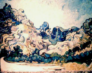
Fig. 3-40. Van Gogh chose an analagous color scheme with primary blue and secondary green in his Mountains of St. Remy of 1889. The closely-controlled (cool) palette offsets his agitated brushwork.
We also speak objectively of warm and cool color, and those terms are necessarily relative. Our perception of any color is dramatically effected by the field (meaning “background”) upon which we see it. Normally, a line drawn across the color wheel from purple to chartreuse leaves the warm colors above, and the cools below. (See Fig. 3-41.) It is relatively easy to separate warm reds and yellow-ochres from cool greens in Norwegian Landscape (1911) by Schmidt- Rotluff (Fig. 3- 42). Here we can also see the spatial sensation induced in our retina by color, for the warm red mountain appears to project from the “distance” and cohere spatially with a receding frontal plane which includes cool greens. The “result” is an optical sensation of “flatness,”which affirms the physical nature of the canvas, rather than creating an “illusion” of distance. Cezanne was a pioneer in demonstrating that one can manipulate the viewer’s perception of space by careful handling of warm and cool color. His repeated painting of Mt. St. Victoire, like Monet’s many cathedral studies at Rouen, evidences profound determination among late-19thcentury artists to understand the physiology of human optical sensation.
Spacial
Among others who seriously experimented with retinal phenomena was Pierre Bonnard, whose 1921 canvas, The Open Window (Fig 3-45), isolates recessive blues and green in the “distance,” while defining the “interior” space entirely in warm orange/yellow passages that “project” toward the viewer. But it was probably Matisse who was most determined among these “spatial colorists.” In his study called Pumpkin (Fig. 3-46, n.d.), the artist created a “warm frontal plane” of primary red/ ochre/blue delimited by a “transitional” violet hedgerow, while the “distant” landscape remains recessive secondary grey-green with a warm purple layer thrusting from behind.
Local
Another “type” of color, to which we referred earlier, is local color, a hue limited to some particular form, and hence not spilling over into the surrounding ground (See Fig. 3-47).Typically, this approach to color is related to a linear style of painting, as opposed to a painterly style, and generally indicates a “conceptual” viewpoint that distinguishes between objects as opposed to fusing them in a painterly pastiche.Matisse’s blue Pumpkin (Fig. 3-46) utilizes local, cool, and “irrational” color, serving primarily a spatial function by virtue of its tactile modeling.
Irrational Color
Since the Post-Impressionist painter, Gauguin, “liberated” color from the constraints of a descriptive role and discovered its decorative capacity, we have been forced to make a distinction between rational color and color which is irrational. By that, we mean simply that color which conforms to our experience of Nature may be considered rational, while colors of the imagination are irrational.
Rational Color
In his painting entitled The Yellow Christ, (1889, Fig. 3-48), Gauguin chose redorange for trees and yellow-ochre for the hillside, as part of an irrational analagous color scheme. Since Gauguin felt no obligation to be “truthful to Nature,” as had Asher B. Durand, his contemporary in America (Study at Marbletown, N.Y., n.d., Fig. 3-49), no viewer would suppose Gauguin painted actual colors of the Breton landscape. Gauguin evidently intended the “hot” palette as “expressive” rather than “descriptive,” perhaps reflecting on human foibles unfolding beyond the image of Christ, where a dark male figure pursues two women, oblivious to nearby worshipers.
Freed from its descriptive role by the end of the 19th century, color, like chiaroscuro, began to range over a wide spectrum of new functions. From Gauguin’s decorative usage and Cezanne’s spatial experiments, we saw Van Gogh harness color to deeply emotional purposes. Later, in the 20th century, Kandinsky saw color as purely spiritual, while Op-art continued physiological (optical) experiments initiated by the Impressionists.


Fig. 3-34. Picasso's figurative study called The Lovers (1923) virtually defines the "Color Wheel," with its recitation of primary,secondary and tertiary colors.

Fig. 3-36. Matisse becomes "formalist" by limiting his palette to primary color, but is boldly experimental in his rejection of traditional chiaroscuro. ( Lady in Blue, 1937)

Fig. 3-37. Secondary color (green, purple, orange) dominates the scheme with which Marc Chagall captures his fanciful Green Violinist. (n.d.)

Fig. 3-39. Schematic above focuses on relationships of various types of color on the traditional "color wheel."

Fig. 3-41. Color wheel can be roughly articulated into "warm" and "cool" zones.

Fig. 3-42. A Norwegian Landscape (1911) by Schmidt-Rotluff exploits spatial aspects of color to "flatten" one's perception of space.


Figs. 3-43 (top)& 3-44. Cezanne's oft-painted Montagne Sainte Victoire became foil for a grand series of experiments with retinal perception of space, based on juxtaposition of warm and cool color. Cezanne moved distant planes toward the viewer with warm lavander hues, while creating recessive greens in what appears to be the foreground.


Fig. 3-45. Bonnard's The Open Window (1921, top) and Matisse's Pumpkin (n.d., Fig. 3-46, above) employ warm and cool color to "structure" viewers experience of 93 interior and exterior space.

Fig. 3-47. Local color defines specific shapes in Picasso's Italian Girl (n.d.), much as in a stained-glass window.

Fig. 3-49. "Rational" coloration of American painter, Asher B. Durand, was held to a standard of "truthfulness" by contemporarty critics. (Study at Marbletown, N.Y. (n.d.)


Fig. 3-48. An imagined landscape with analagous orange trees and ochre fields creates irrational tension in Gauguin's The Yellow Christ (1889), top, and detail above.