Color and Feeling
Having disposed of a few semantic problems that might stand in our way, we can proceed now to talk about subjective aspects of color — just how various colors and combinations of color may effect us emotionally. By the nature of its subjectivity, we can predict that any such discussion of feelings derived from color will not find universal agreement.
One emotional variable would seem fairly reliable: high color saturation or intensity produces stronger responses than color which has weak intensity. And quite apart from saturation, variations from light-to-dark (or value) are not substantially different with color than with black and white. Darker values of yellow, for example, become brown, but remain on the warm side of the spectrum. Dilution with gray would of course cool yellow, and alter its emotional impact.

Fig. 3-52. Marc Chagall effects child-like naivete with primary color-scheme in his gouache fantasy, Circus. (1966)
In general, as mentioned earlier, primary colors are associated with basic human experience: red is so fundamental it runs in our veins; blue seems related to Nature, to sky and sea; whereas yellow may relate to the realm of spirit, or treasures of ineffable worth (Fig. 3-52). One is not surprised to see primary colors in the great stained-glass windows of Europe (see Fig. 3-51, Chartres Cathedral, 12th cen.), or in a High Renaissance painting of the Madonna and Child, n.d. (Fig. 3-50) by Raphael. We sometimes speak of these as “Gothic colors,” because pious masters such as Fra Angelico frequently limited their palette to primaries in an effort to make their religious images as “pure as possible.”
Secondary colors appear to be more complex emotionally. Take for example a painting called Woman with Hat (1905, Fig. 3-54) by Henri Matisse. With its predominantly green/orange scheme, punctuated with purplish hues in the hat, we are easily led to conclude that Matisse sought to endow this image with some fairly complicated emotional baggage. (Another viewpoint might be that the artist was also experimenting here with “synthetic” spatial effects derived from proximity of analagous colors: blue/green; orange/yellow.) But, seeing this portrait beside Picasso’s primary Portrait of Madame Z (1954), one can certainly experience the radical subjective differences schematic color choices make. Comparatively, “Madame Z” appears almost an icon, robust and emotionally powerful.
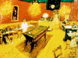
Fig. 3-55. Subjective color considerations outweigh the descriptive impulse in Van Gogh’s Night Cafe (1888).
Van Gogh wrote his brother Theo concerning colors in his well-known painting, Night Cafe (1888, Fig. 3-55): “I have tried to express the terrible passions of humanity by means of red and green. . . Everywhere there is a clash and contrast of the most alien reds and greens in figures of little sleeping hooligans in the empty dreary room, in violet and blue. . . It is colour not locally true from the point of view of the stereoscopic realist, but colour to suggest the emotion of an ardent temperment.” Van Gogh’s adaptation of these complimentary colors (red and green) to express what he called “the powers of darkness” suggests the depth of this painter’s subjective stake in tensions of a particular palette. The artist makes it plain that his choice of color has only marginal reference to “optical reality,” and everything to do with emotional dynamics of color relationships.
Probably most of our subjective responses to color cohere around differences between warm and cool. A room which is dominated by warm hues (projecting) seems “tight” or “small” by comparison with a cool environment. When we describe a space as “cold,” however, that statement has strong emotional connotations. Van Gogh chose a largely-secondary color scheme for one of his three paintings of the Sanitarium room in which he lived toward the end of his life (Fig. 3-56), and one experiences the prevailing coldness of a greenish floor, broken only by tension of a hot reddish blanket and orange plane of the wooden bed. Coloristic tension here is augmented by spatial tension of windows that press in, pictures that lean rakishly, and corners of the room that encroach irrationally on rectangular space. Van Gogh adds the device we call “elevator perspective” (a changing vantagepoint) to further confound the senses.
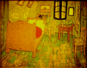
Fig. 3-56. A variety of coloristic and spatial devices effect an uneasy aura of alienation in Van Gogh’s view of his Room at Arles, (1889).
In contrast to the image of Van Gogh’s room, one can experience another “subjective” dimension of cool color in an interior by Henri Matisse, called The Piano Lesson. (Fig. 3-57) Here, the artist creates a largely analagous (blue/green) scheme which results in an impression quite opposite from Van Gogh’s hermetically enclosed interior. Matisse introduces a warm plane in the foreground (pianotop), somewhat comparable to Van Gogh’s bed, but now it mitigates emotional austerity of a rather starkly cool interior, and gives us a comfortable access.
A twenty-year span in the career of the same artist gives us a rather interesting comparison between two studies of seated women (Figs. 3-58 & 3-59). Once again, it appears that a primary scheme begets an effect of ingenuous simplicity, while a secondary scheme suggests relative complexity and psychological uncertainty. It was during roughly this same span of time that Matisse appears to have systematically reversed the canon of Renaissance “Humanism” which made the figure central and “nature” (surroundings) subordinate. In the later of the two works (Fig. 3-58), the woman seems no more substantial than the thinly painted surface upon which her image “floats.”
That artists use warm and cool, primary and secondary, rational and irrational color simultaneously for psychological, spatial and even “formal” reasons can be seen in a pair of interiors pictured below. One, by Edvard Munch (Fig. 3-60), is predominantly secondary and spatial, creating a lugubrious, funerial atmosphere, while the other, by Matisse (Fig. 3-61), is predominantly warm, primary, complementary and planar, and by its color scheme alone, conveys a salutory feeling of Mediterranean optimism regarding the human situation.
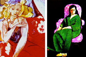
Fig. 3-58. Henri Matisse’s Girl on a Red Background (1936, left) conveys the ” ideal” qualities of a primary scheme, contrasting the emotional complexity of his secondary work, The Green Robe of 1916. (Fig. 3-59, rt.)
Both of these paintings are “formalist,”in the respect that the artist evidently selected an apriori color system (secondary for Munch, primary/complementary for Matisse), and subjugated descriptive coloration to that scheme. Like a minor key in music, the Munch colors imply psychological tension, reinforced by the described emotional detachment of grieving family members in the sick-room. (See also, Fig. 2-37.) In contrast, Matisse surrounds his placid domestic figure in a “seamless” primary environment in which the projecting red plane of his wall and tablecloth embrace complementary blue and orange.
Individual experience of these paintings obviously invokes all manner of “personal associations,” where feelings predominate over analysis. The artist must be able to control such subjective elements in concert with other perceptual factors (such as space), also directly effected by choices of color.
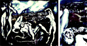
Fig. 3-64. El Greco eschews rational flesh-tones in figures of The Laocoon (above, left), but introduces murky sanguinary color to “project” a background image of what may well be Toledo. (Fig. 3-65/ detail, above right)
And surely, no comprehensive discussion of an artist’s color-choices would be complete without touching on the decision not to use color. As in contemporary cinema, there are occasions when the choice of a “black-andwhite” medium has dramatic impact on the viewer. (Fig. 3-62) Andre Derain elects to render a traditionally colorful genre (the still life) in neutral and seemingly irrational tones (colorless apples), apparently as an essay on structural possibilities of chiaroscuro. The absence of rational color is underscored by scattered earth tones and a single pool of dark blue, reminiscent of the vibrant blue of a Cezanne Still Life (Fig. 3-63) which may have helped inspire Derain’s near-monochrome essay.
El Greco’s palette was altered dramatically by his disillusionment with excesses of the Inquisition, and in the last decade of his career the famous Laocoon reflected this highly subjective use of color. (Fig. 3-64) Figures of the legendary father and his four sons are depicted almost in monochrome in the foreground, while a tapestry of warm color “projects” the background city (of the Inquisition?) into the plane of their anguish.


Fig. 3-50. (top) Raphael's Madonna and Child (n.d.) perpetuates traditional reliance on Primary color often used for "religious" subjects seen in Medieval stained glass. (Fig. 3- 51, Chartres Cathedral, above, mid-12th c.)


Fig. 3-53. Contrasting subjective impact of Secondary and Primary schemes is evidenced by Matisse's Woman with Hat (1905, top), and Picasso's Portrait of Madame Z, (1954, Fig. 3-54, above).

Fig. 3-57. Henri Matisse's Piano Lesson utilizes a "mixed" primary and analagous scheme to "collapse" rational space into cool but shallow intimacy.


Fig. 3-60. (top) Complex human emotions resonate among alienated figures in Munch's secondary Death in a Sickroom (1895), while Matisse (Fig. 3-61, above) evokes pleasurable sensations in his preeminently primary color scheme of Red Room (1908-09).


Fig. 3-62. "Colorlessness" becomes an expressive tool in Derain's Still Life, n.d. (top), contrasted with Cezanne's earlier experiment with projecting warm color, above. (Fig. 3-63, Still Life, n.d.)