Is Modern Art Childlike?

Poetic Landscape (Fig. 5-35, 1937) by Joan Miro mingles rudimentary ideograms of house, moon, tree and paddock on a universal blue ground.
If we sometimes perceive 20th century art as having “Primitive” traits, it is also likely that we have confronted some painting or sculpture of the period which seemed to display a “Childlike” quality. (Fig. 5-35)
This for many is bothersome, for it suggests a) that mature artists are patronizing their viewers, or b) that a child’s level of technique and content is all that museum curators and collectors feel is necessary in serious art.
Perhaps there is another way to understand this phenomenon, but first, we must grasp certain qualities associated with “children’s art,” and determine how they might have functioned in the cause of 20th-century consciousness.
One discernible characteristic of the art of most children is its conceptual nature. A child normally draws a house, a tree or a car. Each discrete element has its own literary “integrity,” and parts are linked only by the “storytelling thread” with which the child ties them together. Sometimes, in visual statements of more-advanced children, a “horizon line” will be used to integrate conceptual elements into a common space. However, a wholistic or “plastic” overview of the visual image is rare at this early stage of human development.

A child’s image (Fig. 5-39,) frequently presents discrete forms linked principally by their narrative relationship rather than by color, tonality or visual pattern.
We see this childlike conceptual “mannerism” in the art of Joan Miro, a Spanish contemporary of Picasso. In a painting entitled La Nuit, (Fig. 5-36, n.d.) Miro describes figures reminiscent of the “Cat and the Fiddle” rhymes of our childhood. A cartoonish “Man in the Moon” floats beside a blue Moon, while nearby, a detached “cat” and cloudlike fiddle cavort around a playful balloon.
Contributing to the aura of “childlike” qualities in the Miro painting is another trait which normally differentiates the work of a child or untrained amateur artist from that of a professional. In the illustrated rendering, one can see that aside from a universal blue background coloration, there is no attempt to “visually connect” separate elements, as for instance Cezanne might. The artist doubtless understood that an average child’s perceptual awareness has not developed to a point where plastic “unification” is a consideration. In the language of visual expression, a close figureground relationship has not been established.
The term “figure” may refer to any discernable form within the painting, drawing or print, while the contrasting term “ground” refers to that particular tonality or color upon which a given figure rests. A bowl may constitute the ground for an apple, a table for the bowl, and so on.

American painter, Mary Cassatt, an expatriate in Paris, was influenced by Degas and by Japanese prints in her emphasis on striking figureground relationships (Fig. 5-40, Lamp, n.d.).
Some of the means by which artists connect pictorial elements visually include: tonality, line, texture or color, as evidenced by the intricate web of relationships in Donald Friend’s painting, Fisherman’s Son: Nocturne. (Fig. 5-29) A light figure may be placed against a dark ground, or the reverse, but each element in the design is perceived in context of its immediate surroundings. The human eye may follow “continuities” such as the dark linear form which wraps around the fisherman’s waist and “connects” him with darkness enveloping the background fishing vessels. Or the eye may perceive repeated “pyramid” forms recurring throughout the image: the boy himself, then fishing nets supported by masts on the vessels.
It would be a very rare child that would work toward an “integrated” figure/ ground pattern of this nature, and indeed it is the rare professional who consciously dismisses that concern. (Fig. 5-38)
In the case of Miro’s painting, Woman, Newspaper and Dog, (Fig. 5-38, 1925), it is fairly obvious that the artist has avoided sophisticated visual relationships among various objects in his design. Its “cut-out”-inspired subject-matter suggests a “naive” approach to design (Fig. 5-35), and Miro would appear to have chosen childlike representational language to match his simple narrative theme.
Two works by an American artist who devoted most of her adult years to a painting career in France may shed further light on this critical figure / ground relationship. Cassatt’s picture, The Lamp (Fig. 5-40) is elaborately orchestrated in terms of an interconnected light-and-dark pattern, and one tends to concentrate more on the visual impact than on possible literary substance. Cassatt was a protege of Edgar Degas, who, like Cezanne and Seurat was a votary of strong plastic coherance. Complex visual structure of Cassatt’s best works may reflect high regard for her mentor’s taste, plus excitement generated in Paris at about this same time by the appearance of bold Japanese wood cuts.
In contrast to The Lamp, Mary Cassatt’s work entitled Mother’s Kiss, (Fig. 5-41) depicts her favorite subject against a largely-unstructured background, conveying a mood of “simplicity” not unlike that of the landscape by Miro. The artist’s focus on maternal emotion is not diluted by complex visual organization.

Picasso’s Guernica (Fig. 5-43, 1937) simplified the grotesque as only a child’s imagination might be expected to.
Another tendancy in the art of children is use of “local color.” Rather than diffusing color throughout a painted image, the child generally identifies color with certain objects (rational color-blue sky, green grass) and playfully decorates the picture-surface accordingly. We sense that giddy freedom in the Miro paintings, and in selected works by Klee, Chagall, Matisse, Picasso and Dufy, among others, indicating a number of Modern painters found the idiom of naive style refreshing in a world often dominated by virtuosity and complex subject matter. Still Life on a Table (Fig. 5-42) by Picasso, explored the mannerism of local color in “posterlike” fashion, but “uncomplicated” subject-matter never seemed to captivate this Spanish artist as it did Miro (see other relevant Picassos, Figs. 3-47 and 3-54). Six years later, in his Guernica (Fig. 5-43, 1937), which dealt with carnage by German dive-bombers during the Spanish Civil War, Picasso abandoned rational color of the Renaissance, utilizing a collage-like monochrome and complex figure-ground interplay to convey horrors of (then) unconventional attacks on civilian population. Could Guernica‘s two-dimensional pathos owe something to the “cut-out” style alluded to above?
One can only conclude that in a period of mega-wars and pogroms, artists quite-understandably found the visual language of childhood a refreshingly escapist antidote. While appearing to denigrate historical norms of “museum art,” these 20th century artists actually fought to maintain relevance in a period of self-conscious stylistic revolution. A public jaded by the “comfortable” aesthetic of Impressionism and shocked by the emergence of Post-Impressionism and Cubism was ready to embrace naivete as a worthy diversion.
How is a building like a statue?
The question “How is a building like a statue?” raises some significant aesthetic issues relating to architectural design. Most of us are accustomed to living and working in a traditional “box” with four walls and a roof on it. But new technologies have sparked renewed interest among some architects in formal aspects of their buildings (the way design elements are put together), materially changing the way we look at architectural problems.
Take, for example, Richard Neutra’s Schindler House in Hollywood Hills, near Los Angeles. (Fig. 5-44) In our photograph, the structure bears a remarkable resemblance to a sculptured figure by Henry Moore (Reclining Figure in wood, 1945/46, Fig. 5-45). Both designers focus our attention on solids and voids, on planes articulating space, on patterns of light-and-shadow, and on a dominant tactile approach to form. What might in some circumstances be defined simply as “porches, walls or roof,” in this building serve a dual function: they are also vertical or horizontal components in a plastic design. Light and shadow become vital elements in that formal organization, just as they are in the work of sculptor, Henry Moore. Moore has subordinated traditional descriptive values (leg, arm, head) to geometry (horizontals, verticals, sphere) in producing a plastic structure analagous to Neutra’s.
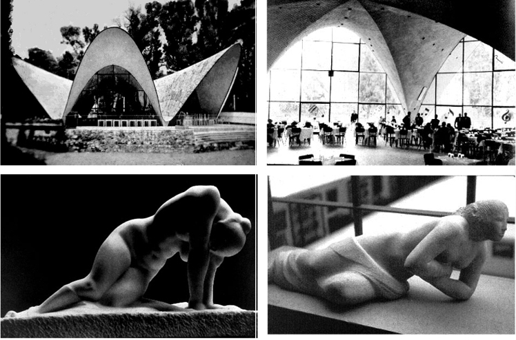
Aesthetically exciting “weightlessness” of Felix Candela’s concrete-and-glass restaurant in Xochimilco (Fig. 5-50, 5-51, top) also informs carved stone figures by Americans, Henry Kreis (Fig. 5-52, Reclining Half Nude, limestone, above right) and Vincent Glinsky (Fig. 5-53, The A wakening, marble, above left).
One might make a similar comparison between a Reclining Nude by Henri Matisse (Fig. 5-46, 1907/bronze), and the Arts Center at Sarah Lawrence College by Marcel Breuer (Fig. 5-47, 1950). You may notice there are walls of various materials moving through the foreground of the art building photograph, with no apparent structural function. But comparison with the Matisse figure suggests that from a plastic viewpoint , those walls fulfill an organizing function not dissimilar to that of the “base” of the sculpture, a plane which coheres visually with the parallel thigh and shoulder plane of the reclining figure. Horizontal and vertical elements are orchestrated in the architecture much as they appear in the sculpture, with no part that doesn’t contribute to the ascending rhythms of the whole
The parallel between buildings and sculpture can also be seen in images of a sculpture by American, William Zorach (Fig. 5-49, Mother and Child, Spanish marble, 1927-30) and a Romanesque church (Fig. 5-48, St. Martin’s, Chapaize, France, 11th cen.) Both have an aspiring (vertical) pyramidal form, with a number of diagonal “transitions” along ascending axes. A rounded chapel adjacent to the semicircular choir of the church gives relief from the “cubic” aspect of the stone building, somewhat analagous to kneecaps, heads and shoulders relieving the squareness of the mother’s figure. The Medieval architect employs sloping tile roof-lines in much the same (plastic) fashion as Zorach breaks his planar rhythm with maternal hands carrying the diagonal movement upward. Both designers elect solid, tactile masses rather than decorative, light-sensitive surfaces.

Dying Warrior by Aristede Maillol (Fig. 5-54, 1930/ stone, above) exploits “structural” geometry to lighten ponderation of collapsing figure.
With today’s complex buildings, it is difficult for a designer to impose formal constraints on the conception beforehand, as pyramid-builders or Byzantine Emperors obviously did in times past. But noteworthy architects past and present have taken an organic view of their creations, combin- ing an effective plan (inside) with an overall sense of sculptural unity (outside).
One profoundly important factor effecting both the fields of architectural design and sculpture is the element of gravitational ponderation: the apparent weight of a building or sculptural form. The architect, Felix Candela (Figs. 5-50-5-51), and American sculptors, Henry Kreis (Fig. 5-52) and Vincent Glinsky (Fig. 5-53), have manipulated dense materials such as reinforced-concrete, marble and limestone to produce an effect of “lightness,” enabling a restaurant and two massive stone figures to “float” effortlessly in space

In Fig. 5-55, 1957 above, Marcel Breuer “floats” mass of Paris UNESCO building on V-shaped supports in similar negation of gravity.
An understanding of the aesthetic effect of “weightlessness”in sculpture and building is not a modern achievement. If you will refer to an Archaic Greek Fallen Warrior (Fig. 2-34) from the pediment of the Temple of Aegina (circa 510 B.C.), you will see that the Aegina sculptor grasped clearly the notion that pathos, (the sacrifice of a “hero”) could be ameliorated by creating not a limp,moribund figure, but one with bouyancy and resiliency—supported largely by his round shield, an extended hand and relaxed lower extremities.
In 1930, the French-modern master, Aristide Maillol, was commissioned to execute a War Memorial at Banyuls, France, for soldiers who died in World War I, and it is noteworthy that his relief figure, (shown in Fig. 5-54), seems physiologically to hover between life and death, but in terms of ponderation, the dying figure appears without heaviness, in part due to the (formal) arrangement of his limbs and head. Everything is supported by static rectangular or pyramidal geometric order.
You may also note a comparable achievement of “weightlessness” in the 1957 design for a UNESCO Secretariat Building by Marcel Breuer (Fig. 5-55), in which he utilized light, V shaped supports for the recessed ground-floor, which combine with strong vertical extremities to make the building appear to be “floating,” much like the Banyuls figure.

“Gothic” attenuation seen in masonry vaulting of Bourges Cathedral (Fig. 5-58/ left) informs 20th-cen. bronze Standing Youth by Wilhelm Lehmbruck (Fig. 5-59, 1913/ right).
This phenomenon of ponderation was likewise an issue rekindled by the Italian Renaissance. For example, we can see a transformation in the art of Brunelleschi between design of the Pitti Palace (Fig. 5-56) and the Foundling Hospital (Fig. 5-57) which he completed after a sojourn in Rome with Donatello. Lightness of the arcade supporting the Hospital’s upper level produces an effect of weightlessness in the eclectic design, while the Pitti‘s “loaf-like” structure hugs the ground like a Frank Lloyd Wright “Prairie House.” It is, in fact, difficult to separate this Renaissance “flight-from-ponderation” from an inexorable movement toward religious tolerance and rationalism in much of Europe during the same period (cf. Giotto, Fig. 3-10 and Botticelli, Fig. 3-12.
Clearly, a primary thrust of the complex evolution of Gothic vault-design in the 12th and 13th centuries (Fig. 5-58) was to “lighten” ponderous “Latinisms” of earlier Romanesque structures, much as Brunelleschi did after seeing Rome. A modern “Gothic ponderation” similarly inspires the Standing Y outh of early 20th-cen. German sculptor, Wilhelm Lehmbruck (Fig. 5-59), while another German master, Ernst Barlach, also explores expressive extremities of ponderation in his two carvings (Figs. 5-60, Old Woman Dancing and Fig. 5-61, Insane Man).

Nursery-rhyme figures in Miro's La Nuit (Fig. 5-36,) float against a plain bluish "ground" to which their ties are more conceptual than plastic.


Complex tonal relationships "connect" foreground figure with surroundings in Fisherman's son: Nocturne by Donald Friend. (Fig. 5-37, top) Contrast Joan Miro's W oman, Newspaper and Dog (Fig. 5-38, above) with it's affinity to a child's "cut-out" design.

Decorative textile design and plain ground give precedence to emotion over visual structure in Mother's Kiss, (Fig. 5-41,) by Cassatt.

Picasso's Still Life on a T able, 1931, demonstrates a collage-like pastiche of figures described with little or no color-mixing. (Fig. 5-42)


Cantilevered roof and deck lines of Richard Neutra's Schindler House (Fig. 5-44, top) echo horizontal "architectonic" masses of Henry Moore's Reclining Figure (Fig. 5-45, wood - 1945-46, above ) as formal concerns prevail over vernacular building tradition.


Planes-in-space organize both architectural and human form in comparison of Art Center (Fig. 5-47,1950, top) by Marcel Breuer and Reclining Nude (Fig. 5-46, bronze, 1907, above) by Henri Matisse.


Designed for security, Brunelleschi's 1435 Pitti Palace (Fig, 5-56, top) has a Medieval heaviness, while the later Foundling Hospital (Fig. 5-57, above) transmutes Latin proportions into almost lyrical rhythms that belie its massiveness.


Ascending elements of a Medieval church (Fig. 5-48, Chapaize, 11th cen. France, top) have many parallels with "architecture" of Wm. Zorach's Mother and Child (Fig. 5-49, Spanish marble, 1927-30, above). Both rely on diagonal rhythms of subordinate masses, building to a pyramidal whole with little surface embellishment.


Ernst Barlach's Old Woman Dancing (Fig. 5-60, 1920/ top) "levitates" compared with Insane Man (Fig. 5-61, 1910, above ) who is "grounded" like a locomotive.