Modern or Primitive?
Now, with a shared vocabulary for discussing artistic expression, we can look into some questions that might have occurred to you as we went along.
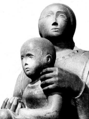
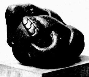
For example, you may have noticed that “Modern Art” — that is, work produced during the 20th century — frequently resembled art produced by primitive societies (Fig. 5-1) or, in other instances, the creations of children. Juxtaposition of such terms as “Modern,” “childlike” or “primitive” seems curious in light of the aura of sophistication surrounding many art museums.

Fig. 5-1. 20th-cen. stonecarving by Cleo Hartwig (Indian Woman, right) displays characteristics often associated with “primitive” art.
It is also noteworthy that during this period some forms of sculpture and architecture demonstrate visible similarities. In the past, sculpture has traditionally been a “decoration” for architecture, but the 20th-century has seen some radical changes in this relationship — in some cases, a building becomes “sculpture” itself, while sculpture has simultaneously relinquished much of its time-honored descriptive function in favor of “formal” concerns (both plastic and decorative) for “geometric form.” Perhaps a good place to begin exploration of this phenomenon is to look at certain characteristics of “primitive” art that also appear in works by “Moderns.” This may enable us to determine how important these similarities really are.
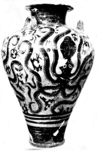
Cultures in their early or “primitive” stages often seem to produce pottery as an art form combining utilitarian and aesthetic functions quite unselfconsciously. By looking at several examples of pottery design above, we can perhaps focus on at least one significant aspect of “primitive consciousness,” that trait called “space-shyness.”
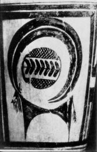
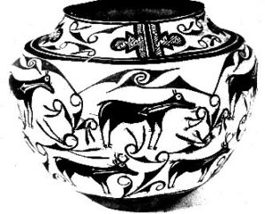
Pottery forms represented here (Figs. 5-2, 5-3, 5-4 and 5-5) are taken from a wide range of cultures extending from ancient Mesopotamia and the Aegean civilization of Crete to 6th-century Greece and a 19th-cen. American Zuni Pueblo.
Approximately three millennia before Christ, a potter of Susa (Mesopotamia) drew an Ibex on his vase, with horns defining a bold circular motif. (Fig. 5-3) Evidently perplexed by a “hole” at the center of his design, however, the artist went on to place a circular shape in the “void,” which doesn’t appear to link conceptually with the rest of his design.

Fig. 5-6. Pre-Columbian image of ” Feathered Serpent” (left/ 1000-1500 AD) from Mexico is surrounded by visual “devices” designed to preempt space not integral to serpent design.
Sometime prior to 1500 B.C., Minonan potters on the Island of Crete developed a unique decorative style typified here by the Octopus Vase in Fig. 5-2. Covering the surface of the “jug” is a varied skein of tentacles, but wherever a significant “space” would have occured between them, the artist has injected some exotic species of marine life to eliminate the “void.” Similarly, a Greek potter depicting a procession of horses on his vase in Fig. 5-5, found the empty space between the horses’ legs an embarrassment, and inexplicably introduced gratuitous bird images to fill it.
The Zuni pottery-painter in Fig. 5-4 decorated his vessel with two tiers of fairly-naturalistic deer or elk, but wherever the animal-forms fail to occupy the surface fully, a “non-objective” geometric shape is introduced to “fill the vacuum.” This apparent “abhorence of a vacuum” prompts usage of the expression, space-shyness to describe primitive orientation to undefined space. A Pre-Columbian pottery design (Fig. 5-6) evidences the trait in yet another culture.
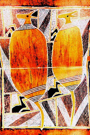
Comparison of kangaroos painted by Australian aborigines and a canvas by Picasso (Figs. 5-7 and 5-8) brings this quality of space-shyness into “contemporary” focus. Both artists have relied heavily on textured decorative shapes to cover a rectangular space, and neither evidently felt comfortable leaving significant “open areas” in their design. Picasso used the sophisticated geometry of Cubist style to acheive much the same “busy” pattern-effect as the naive aboriginal painter of Australia.

Tribesmen of New Guinea cover entire surface of artifact with pattern (Fig. 5-10, left) in much the same fashion as Braque in his W oman with Mandolin (Fig. 5-9 / 1937, right)
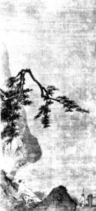
Braque’s painting entitled Woman with Mandolin, 1937 (Fig. 5-9), also shows reluctance to “come to grips” with empty space, and bears more than a little resemblance to primitive shields by tribesmen of New Guinea in Fig. 5-10. Both apparently felt the need to structure space without conspicuous “lapses” of form and texture. Contrast that “spaceshy” impulse with traditional Chinese landscape painting (Fig. 5-11), in which “infinite space” is an essential component for emphasizing the minimal importance of man. As we look at paintings of such great “Moderns” as Van Gogh, Gauguin, Matisse, Derain, Bonnard, Vuillard and Vlaminck, consider the limited role of space in their painting style, and notice in contrast the “orientalizing” effect a flood of Japanese wood-block prints had on spatial constructions of Degas in the last decades of the 19th century (Fig. 5-12). This artist celebrated the “poetry of movement” in both painting and sculpture, and seemed relatively untouched by that primitive space-shyness which was to condition much of revolutionary stylistic experimentation of the early 20th century.
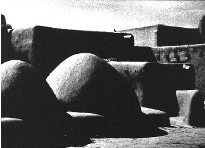
Baking ovens of an American Indian village complex (Fig. 5-13) suggest a primitive predilection for the tactile and perceptual which also seems to occur frequently in 20th century sculpture, such as Mother and Child at Play (Fig. 5-14) a wood-carving by Chaim Gross, or Family, (Fig. 5-15), a stone group by Gustav Vigeland of Norway.
Forms are boldly simplified; “parts” are integrated into a (carved) whole, and “geometry” ap-pears to take precedence over any narrow descriptive motivation. The Gross carving is in many respects like primitive “totem pole” carvings of the Northwest American Indian, which in massive geometry and smooth surface effects invite experience by touch as well as vision. Vigeland’s Family flows into a solid “dome” shape much like the adobe ovens of the Taos Pueblo: static, indivisible and universal.

Perceptual geometry replaces concern for naturalism in features of “archaic” Sumerian Statuette of a Woman, BC. (Fig. 5-16).
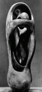
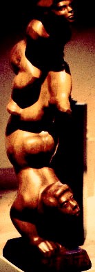
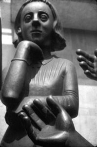
Art such as this frequently relies on the language of convention to define familiar forms. Eyes, ears, hands, feet can be reduced to formal equivalents, as in the Sumerian Statuette of a Woman (Fig. 5-16) or in Brancusi’s Mlle. Pogany, seen in Fig. 2-2. Eyes of the Sumerian piece become simple elliptical shapes, and the folded hands mere “symbols” of reality. We see that same taste for rigorous simplification in a modern head by Barlach (Fig. 2-42), where the nose is planar and geometric, in keeping with other rudimentary features. In addition to Brancusi and Barlach, one might cite Henry Moore (Fig. 5-17) and the unheralded American master, Waldemar Raemisch (Fig. 5-18), as modern exemplars of that “primitive” taste for conventional language (as opposed to a mere description of reality).
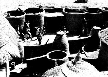
Finally, in the search for characteristics relating modern artistic statements to those of primitive cultures, one may well note an organic or biomorphic bias in certain sculptural or architectural forms of both. Take, for example, an African tribal compound pictured in Fig. 5-21. It is difficult if not impossible to provide a “conceptual” distinction between “inside” and “outside” here. Living spaces flow from “communal” areas to increasingly limited, “private” space, which is eventually enveloped by a series of clustered, covered forms. Walls have a fluid, biomorphic quality characteristic of structures made of clay, and suggest the organic feel of mushrooms or sea shells.
A similar reluctance to isolate or differentiate “parts” is evidenced in Henry Moore’s Internal and External Forms, 1951 (Fig. 5-22), which like the African compound, negates conceptual notions of “inside” and “outside.” In Moore’s piece, a shape suggestive of human form is enveloped in a womb-like cavity and surrounded by other “closed” forms, with little conceptual articulation of “internal” spatial relationships. Similarly, one sees obscuration of differences between “interior” and “exterior” or between “sculpture” and “building” in a pavilion entrance created by Lucian Baldessari for an exhibit at Milan, Italy in 1952. (Fig. 5-23) Like a giant “conch shell,” the architectural form organizes movement according to fluid spatial requirements rather than fixed intellectual or mathematical calculations.
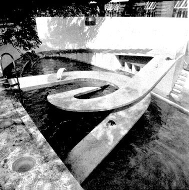
Modern ferro-concrete design to some degree rendered space shyness “retrogressive” in the last century, but perennial usage of biomorphic, tactile and perceptual forms which rely on high-tensile materials persists. (Figs. 523, 5-24. 5-25) Whether this suggests a self-conscious embracing of “primitive” values, or beginning of a “modern Renaissance,” only historians will ultimately be able to determine.
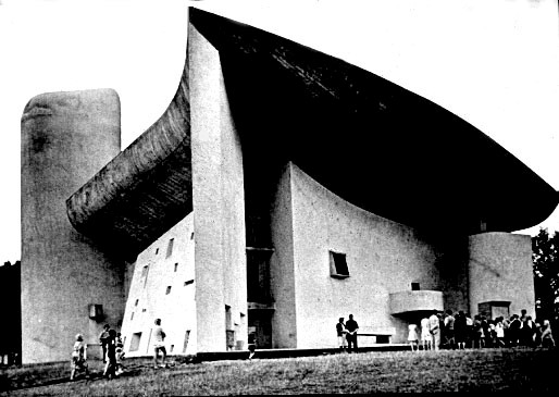
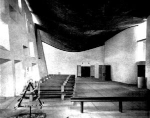
The impact of ferro-concrete (also known as reinforced concrete) on Modern architectural forms has been profound (as we shall see in Part 3 of this Chapter: “How Is a Building Like a Statue? which discusses “ponderation.”) Corbusier challanged our notion that “walls hold up the roof” in his revolutionary church at Ronchamp in France (Fig. 5-27), where a sail-like ferro-concrete roof trumps the daring stone vaults of Medieval cathedrals by “floating above” the pierced walls as though not requiring their support. (Fig. 5-28) Creating a “primitive” grotto-like atmosphere within, the chapel also has a pulpit on an exterior wall, permitting services both inside and outside for faithful on the pilgrimage road. Perhaps Corbusier’s extensive work at Chandigarh in India sensitized him to the power of organic flow from interior to exterior.
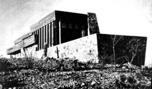
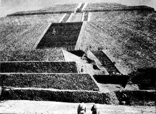
Contrast Corbusier’s ease in the manipulation of space with F.L. Wright’s “earthbound” Rose Pauson House in Phoenix, Arizona (Fig. 5-30). Like the Pre-Columbian Temple of the Sun in Teotihoacan, Mexico (Fig. 5-31), the Pauson House eschews voids, embraces masonry and planar design, and huddles close to the earth in a manner suggestive of space-shyness. (cf. Wright’s Japanese experience.)
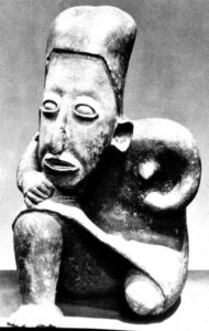
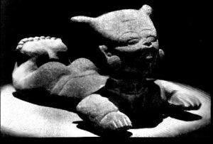
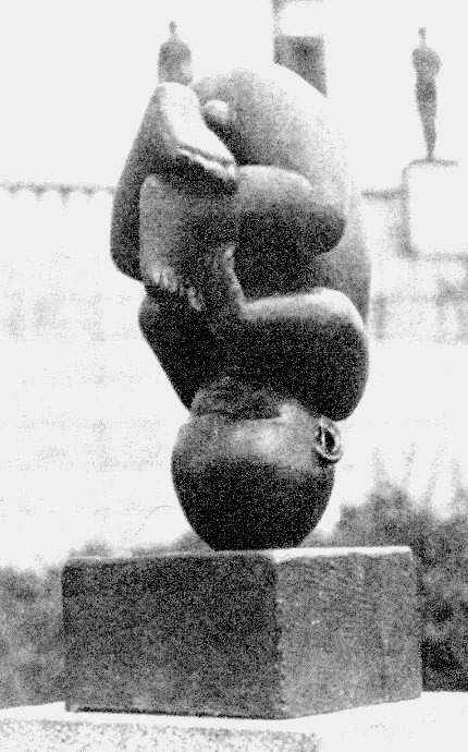
Perceptual qualities of PreColumbian imagination enliven pottery figures of Seated Female (Fig. 5-32, from Nayarit) and Pottery Whistle (Fig. 5-33), with affinity to 20th-cen. Unborn Child (Fig. 5-34, Bronze) by Gustav Vigeland (Oslo, Norway).
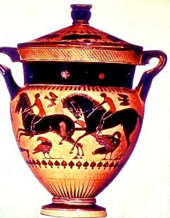
Pottery designs evidence "primitive" trait of "space shyness:" Top to bottom (Fig. 5-2) Minoan/ 1,700 BC; (Fig. 5-3) Susa/ 3,000 BC; (Fig. 5-4) Zuni Pueblo/ 1875 AD; (Fig. 5-5) Greek, Black-Figured Crater/ 530-520 BC. Each employs "devices" to fill voids between descriptive forms.
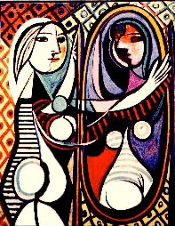
Australian aboriginal painting (Fig. 5-7, top) and Picasso's Girl Looking in a Mirror (Fig. 5-8, 1932, above) reflect common attribute of "space-shyness."
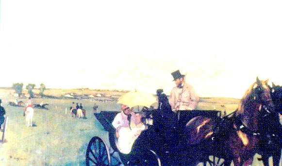
Antithesis of a "space-shy" approach is Chinese design (Fig. 5-11, top, Scholar Contemplating Moon, ink on silk) or Edgar Degas, Carriage at the Races (Fig. 5-12, above) Both embrace vast open space for its "latent" content.
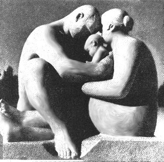
"Primitive" tactile aesthetic embedded in Taos, N.M. Pueblo adobe ovens and structures (Fig. 5-13, top) also informs contemporary wood-carving, Mother and Child at Play, by Chaim Gross (Fig. 5-14, right/ 1927) and Family (Fig, 5-15), a stone-carving by Gustav Vigeland ( 20th cen.) All share broad perceptual geometry and minimal interest in conceptualization of discrete parts.

Ferro-concrete forms at Everson Museum, Syracuse (Fig. 5-24, above) and at London's Regents' Park Penguin Pool,1938 (Fig. 5-25, right) obviously lack space-shyness of primitive consciousness, but both share the organic/perceptual bias and planar quality evidenced by primitive Aztec stonecarving of Snake, top right. (Fig. 5-26, ca 1400 AD)
