The Viewer
Any thorough discussion of the creative process must surely entail consideration of the viewer’s role. Earlier, we attempted to describe certain aspects of the artistic object itself, and then we looked at possible connections between the nature of that object and possible predisposition of an artist toward analytical (conceptual) or wholistic (perceptual) approach.
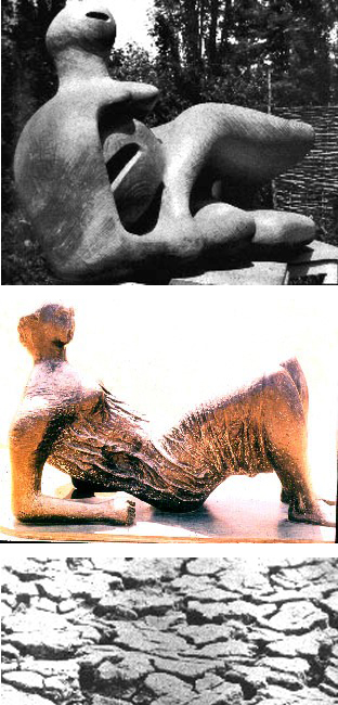
Fig. 2-29. (top) Reclining Figure by Henry Moore (wood, 1945-46) has smooth, tactile surface, while later Draped Reclining Figure (Fig. 2-30, bronze, 1952-57/ above) was given a craggy, heavily-etched surface suggestive of the dessicated earth pictured above. (Fig. 2-31)
If the latter discussion suggests there may be certain qualities inherent in an artist’s mental processes, perhaps we must now also ask if there are predictable responses the artist can anticipate from a viewer. Do certain “signs,” colors, or forms have reasonably constant or predictable effects on the artist’s audience?
As a means of exploring that question, perhaps it would be instructive to observe two additional sculptured works by the English artist, Henry Moore. (Moore, incidentally, by virtue of depth and variety of his work is often considered in a category with such giants as Donatello or Michelangelo. Later on, we will also discuss the modern Norwegian sculptor, Vigeland, another possible candidate for this sculptural “hall-of-fame.”)
The two Moore pieces illustrated (Figs. 2-29, 2-30) were created during and after WWII -when Moore experienced saturation bombing of London and the Battle of Britain, often trapped in London’s subway bomb-shelters. The earlier piece, Reclining Figure, 1945-46, is massive and tactile, with much of the confident body-language of Greek warrior-heros on the pediment of the Temple of Aegina (Fig. 2-34). Moore’s later figure, however, moves awkwardly. The surface of the postwar piece is craggy and eroded, creating an impression of dessication, the dried-up surface of aging skin or “mud-flats.” Moore spoke of “discovering drapery” while watching Britons sleeping in the subways, but also clearly discovered a visual, or one might even say, painterly, aesthetic which he commingled with the youthful virility of his earlier style. The effect is plainly one of “aging,” from a purely intuitive perspective. (See Ivan Albright’s Fleeting Time, Fig. 2-33, painted, not surprizingly, at the start of the Great American Depression.)
Can one assume the average viewer would react predictably to these changes in “content?” Indeed, one can find parallel evolution in Greek pedimental sculpture, and it appears likely that most observers would experience “ripening” as they compare the Fallen Warrior from Aegina (ca. 510 B.C.) with a Phidian marble of seventy years later (442-435 BC /Fig. 2-32). Smooth surfaces and tactile geometry of Aegina seem youthful and resilient, while heavily-draped, female goddesses from the Parthenon display an “etched” surface suggestive of weathered driftwood.
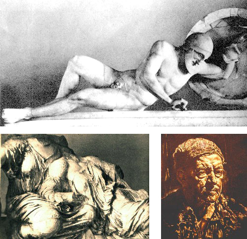
Fig. 2-32. Agitated surface of Three Fates (Parthenon, 442-435 B.C./ left) narrowly pre-dates Peloponnesian War, much as Fig. 2-33, Albright’s Fleeting Time (1929-30,right/ detail), reflects America’s “Great Depression.” Fig. 2-34. Fallen Warrior from Aegina (ca. 510 B.C.,top) celebrates Greek victory over Persian invaders.
Assuredly, on the level of subject-matter, Phidias had “discovered diaphanous drapery” (long an Ionian predilection), but is there not latent content here as well? Historical records suggest that Athenians built the Parthenon with funds misappropriated from neighboring cities such as Sparta and Corinth, and the Peloponnesus was rapidly spiraling downward into fratracidal war.
Encoding a similar message of cultural despair for the modern viewer, a figure by Richier (Fig. 2-35, The Storm, 1949) calls us to experience a similar sensation of decline and atrophy, while Despiau’s adjacent (pre-WWII) image (Fig. 2-36, Assia, 1937) has almost adolescent energy in its smooth, expansive forms.[2] The viewer is plainly an important player in the communicative equasion here — for unless the artist can reasonably anticipate viewer responses, only very rudimentary exchanges could occur.
“The viewer is plainly an important player in the communicative equation. . .”
Viewer responses to color can generally be anticipated by artists, who manipulate audience reaction through choices of color and the way they mix them. Norwegian artist Edvard Munch selected a combination of greenish tone, orange and purple to depict a scene of family grief in Death in the Sickroom, 1892 (Fig. 2-37). These colors are “secondary” (mixed by combining two “primary” colors, and thus, more complex), and often seem to be associated with feelings of tension and discomfort when placed in close proximity.
You might notice too that none of Munch’s figures communicate with one another (by glance or gesture), leaving one with a clear sense of alienation. Munch further orchestrates that feeling of “hollowness” embedded in his acid color scheme by omitting all but oblique reference to the subject of this scene of corporate grief. We cannot “find” the focus of their pathos!
Possibilities for contrasting effects of color and “body language” are clear in another family scene known as The Hatch Family, (1870, Fig. 2-38) by American artist, Eastman Johnson. Several generations interact on various levels of intimacy (even though this was painted during the reserved Victorian era), and color is “pleasantly warm” in the heavily-curtained interior. It would be hard to imagine a viewer failing to “read” a much more open and hospitable atmosphere in the Hatch Family portrait than in the Munch scene above. Though Johnson’s adults seem caught-up in a stiff patriarchal culture, their body language is more relaxed, and children appear capable of communicating with genuine mutuality (see detail, Fig. 2-38a).
Fig. 2-35. Viewer’s response to rough surface texture of Richier’s The Storm (left, 1949/ bronze) invokes imagery of Hiroshima, whereas Despiau’s Assia (Fig. 2-36, right/ 1937, plaster) conveys “classical repose” to “Western” audience.
In contrast, Edward Hopper’s Early Sunday Morning, (1930, Fig. 2-40) is bright and colorful, with hospitable primary reds and yellow upstairs and no appreciable distortion of forms to condition our responses. Also, Hopper’s city is strikingly uncluttered, although the conspicuous absence of pedestrians may create a mild sense of uneasiness for some. Taken overall, the Hopper painting typically arouses responses of nostalgia or curiosity, due to its warm, natural color scheme, early-morning light with heightened contrasts, and a compact “scale” which perhaps empowers the viewer to feel like an “insider.” Both painters have anticipated viewer responses by encoding “cues” such as familiar shapes, the presence or absence of bright color, improbable lighting conditions and suggestions of clear or threatening weather.
Although this sampling provides an extremely limited cross-section of the visual tools an artist may use to effect perceptions of the viewer, one can perhaps conclude from these examples that artists do indeed anticipate a viewer’s response to certain aesthetic stimuli with considerable assurance, at least within a given culture. Without these well-founded expectations, the artist would be communicating in a wordless language of uncertain vocabulary and highly unpredictable impact.
In summary then, we are postulating a complex three-part transaction — a “process” — involving: ARTIST * * * ARTIFACT * * * VIEWER. If we are not accounting for cultural, psychological and sensory impact of any of these “parties” to the equasion, we are not in a very good position to measure depth of communication taking place.
That is why a “quick trip” through any museum is often more unsettling than rewarding. Someone with a typical “Western” aesthetic orientation can hardly anticipate “participating” in the esoteric language of an African wood-carver, except on the most basic level of sensory appreciation of the artifact.That is, perhaps, where the real work of understanding has its genesis. In the comparison below, it is relatively instinctive for the Western mind to associate with the wistful introspection of the Barlach figure (Fig. 2-42, bronze detail), while the carving from the Congo (Fig. 2-41, wood) is based on tribal understandings elusive to the same Western imagination.
1. Claremont Graduate School, Claremont, Calif. 1956
2. Note: For a profoundly-moving expression of American optimism in the period prior to U.S. involvement in WWII, and its impact on emergence of “Modern” design on all levels of culture, see Design This Day by Walter Dorwin Teague, published by Harcourt, Brace in 1940.

Fig. 2-37. Death in the Sickroom (c. 1892) by Edvard Munch, combines color, body language and distortion of space to convey a strong mood of tension/alienation.


Fig. 2-38. In the The Hatch Family by American artist, Eastman Johnson (above), body language and warm color stimulate a very different viewer response (See detail on top, Fig. 2-38a) than in Munch treatment of family in Fig. 2-37.


Fig. 2-39. February Thaw (n.d.) by Charles Burchfield evokes viewer Angst, with its dim, "toothy" facades and macabre color scheme, while Edward Hopper's Early Sunday Morning (Fig. 2-40, 1930, above ) contrasts a tranquil neighborhood of uncluttered facades in lucid color and pristine light.


Fig. 2-41. An African Mask carved from wood (above) is not as "accessible" to the average U.S. museum-goer as, for example, Barlach's bronze Singing Man (Fig. 2-42, detail ) due to cultural differences surrounding creation of the artifact and its uses.